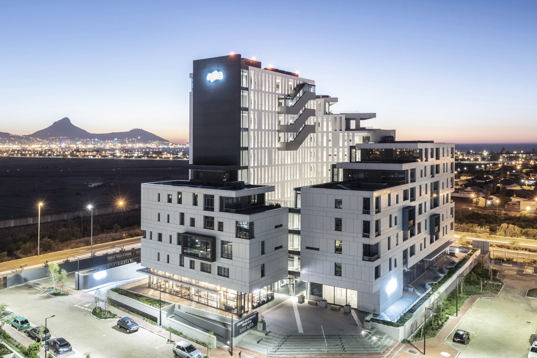
This site is at the a corner of a new mixed-use precinct in Cape Town’s northern suburb of Century City. It sits on the edge of a busy road and across from a disused airfield. It therefore would have uninterrupted views of the iconic Table Mountain in perpetuity. The clients were looking for something iconic to “crown the precinct”. After winning the bid for Sable Park, with our unconventional take on their office model, they they asked us to take a look at the site next to it.
Role: Associate-in-charge – Led concept design, planning and design development. Worked with a technical lead in overseeing documentation and construction
Residential | Area: 10 000m2 | Units: 85 (5 penthouses) | Height: 60m | 10 Floors

The overarching concept was to create a floating, hollow monolith with a striking castle or crown-like profile on the corner of the site. This was a cheeky response to the client’s request and a metaphoric reference to the 1997 Australian comedy, The Castle (about a family living next to an airport). The building rises from a contextually appropriate four storey block and gradually terraces to ten floors while wrapping around itself.


Early study sketches of the terracing monolith. I grounded the block at a single point to create ‘contrapposto’ and emphasize its off-balance weight.


The facade is clad in aluminium composite panels with modules factored into the design from very early on. The choice of off-white was to soften the glare on bright days and also put emphasis on the brighter internal chasm. The installation was quite tricky; the building facade had to be scanned and each individual panel was numbered, scheduled, manufactured and installed.


The internal wall filters light into the walkways and reflects down into the lower courtyard.
It features little break out gardens at different corners.


The end point of every internal walkway offers a different view back into the city, creating a destination vista point on every level.


Walking through Manhattan, I was struck by Foster’s massive red lift in the Bowery. It sat with me for years!
Here, I wanted to add a nighttime spectacle to the building… et voila!


The courtyard is 10m wide but 60m high, giving it a dramatic proportion. For this reason, we call it the “chasm”


