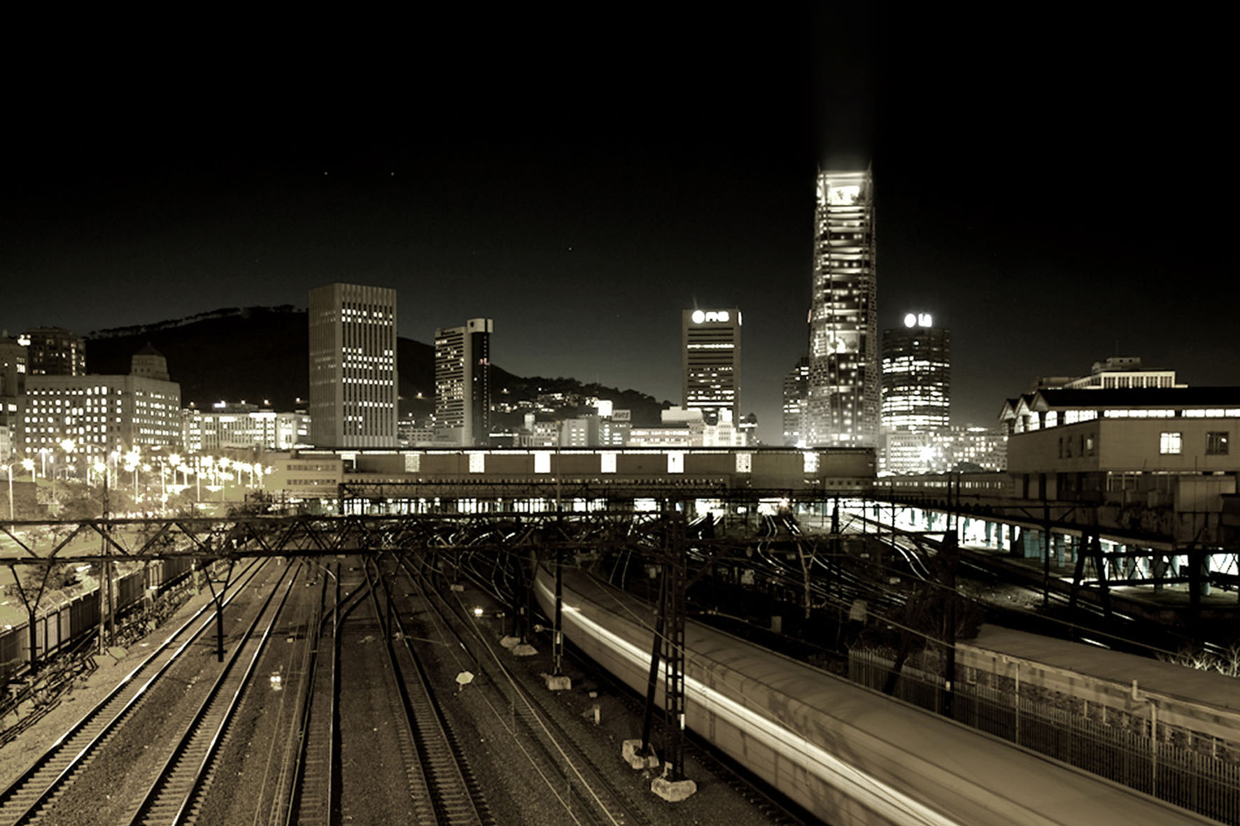
Final thesis dissertations are always daunting! However, I couldn’t wait for this space to explore one of my favourite typologies. Entering my final year, I was discouraged from attempting this project for several reasons – but that’s another story for another day.
Cape Town is dubbed the windy city of South Africa – at certain times of the year it experiences gale force winds of up to 120km/h, which is one of the main reasons developers shy away from high-rises, among other things. In taking on this project, the premise of my investigation was twofold; tackling the climatic issue and re-envisioning the urban threshold of high-rise buildings in the city.

I developed feasibility studies for the best performing wind tunnel models and then tailored them to find a sweet spot


I spent the entire year in this corner. In the pre-Instagram era, all my inspiration physically surrounded me.
By the end of the year everything was a potential skyscraper… even my shampoo bottle.

The building was located right above the central station terminal building with a direct link to the central plaza. The bottom of the tower de-materializes its form as it hits the ground, exposing it’s core as a new urban wall in the plaza. It also pulls the plaza in by creating a series of terracing planes that rise to a public food court at the back of the tower’s base. In this way it creates a new plaza/podium composite base.


I worked with models a lot and physically built every design iteration to test forms, structures and facades.
This ‘expressed structure’ was inspired by Fazlur Khan’s Hancock Centre

I designed an outrigger structure with special wishbone mega columns that directly responded to the building’s faceted form. This system also allowed the building’s layered facade to be its primary expression. The facade had a layered brise soleil system similar to the New York Times building in Manhattan. This was conceived as a translucent composite membrane with large circular cut-outs that would appear as perforated at a large scale. The membrane de-materializes in the direction of the prevailing winds so that it has the appearance of being blown away by it. The layering of the facade also acts to dampen the wind load on the structure.

I dug up every Renzo Piano tower I could think of. I copied his style and studied his planning and details.
That is what gave me the foundation and confidence to make proposals at this scale.
That is how I learnt.


